A big part of the interview process for many data science positions is a data science task or assignment. Companies usually choose a data set that is typical for them, while only in rare cases a sample of their actual production data. Here, I am exploring such a data set, sent out by a leading UK retailer.
The task
Your task is to read all data into your preferred software environment, get an understanding of the various variables that are included, and clean the dataset. Subsequently, proceed to build a model of your choice to predict store sales in the test dataset. You can choose as many methods of evaluating the model.
Data Preparation
We’ll start by reading the data into R and having a look at the basic structure and variables available. Three tables are supplied: stores, train, and test. Since train and test are in the same format, we will combine the two tables in one (called ‘days’) to make reformatting a little easier.
# Any good R-script should use these ;)
library(plyr)
library(dplyr)
library(tidyr)
library(magrittr)

library(ggplot2)
library(gridExtra)
library(ggthemes)

library(caret)
library(glmnet)
library(doMC)

# Keep results reproducible
set.seed(1234)

# Read the tabular data
stores <- read.csv(file = 'original/store.csv')
train <- read.csv(file = 'original/train.csv')
test <- read.csv(file = 'original/test.csv')
days <- rbind(
  cbind(train, set = 'train'),
  cbind(test, set = 'test'))

# inspect the data
head(stores)
head(days)
Put tables here
Apparently, some of the categorical columns were interpreted as integers by R. We’ll fix that and reformat the data to make sure we use columns in an appropriate fashion. We also combine the data on days and shops are combined in one table via a left-hand join.
# Reformatting 'stores'
stores %<>%
  mutate(
    # Stores number as character
    Store = as.character(Store),
    # And CompetitionStart as combination of month and year
      CompetitionStart = ifelse(
      # Where CompetitionOpenSince values are NA
      # we assume competition has been around for a while
      is.na(CompetitionOpenSinceYear), '2000-01-01',
      # Otherwise we paste in month and year and make it a date (assuming 1st)
      paste0('01-',
      CompetitionOpenSinceMonth,'-',
      CompetitionOpenSinceYear)) %>%
      as.Date(format = '%d-%m-%Y'))

# Reformatting 'days'
# Then we combine it with the shop data
days %<>%
  mutate(
    # Again, Stores as character
    Store = as.character(Store),
    # And date into a proper time stamp
    Date = as.Date(Date, format = '%d/%m/%Y')) %>%
# Let's convert categorical information into factors
# mutate_each(funs(as.factor), DayOfWeek) %>%
  # Bring in the shop data
  left_join(stores, by = 'Store') %>%
  # Any entries of 'CompetitionDistance' for days that predate
  # 'CompetitionOpenSince...' are probably invalid. We'll replace them with
  # the mean value of 'CompetitionDistance' across all stores
  mutate(CompetitionDistance = ifelse(
    Date < CompetitionStart,
    mean(stores$CompetitionDistance, na.rm = TRUE),
    CompetitionDistance)) %>%
  # Drop the old CompetitionOpenSince fields
  select(-one_of('CompetitionOpenSinceMonth', 'CompetitionOpenSinceYear'))
Now we can take an initial look at the data to better understand what we’ve got and how we can best put it to use in the modelling exercise. I will use a couple of basic questions to guide my exploration of the data set. Since there is no sales data for the hold-out partition of the data I excluded it from most of the plots in this section.
Which Stores do Well?
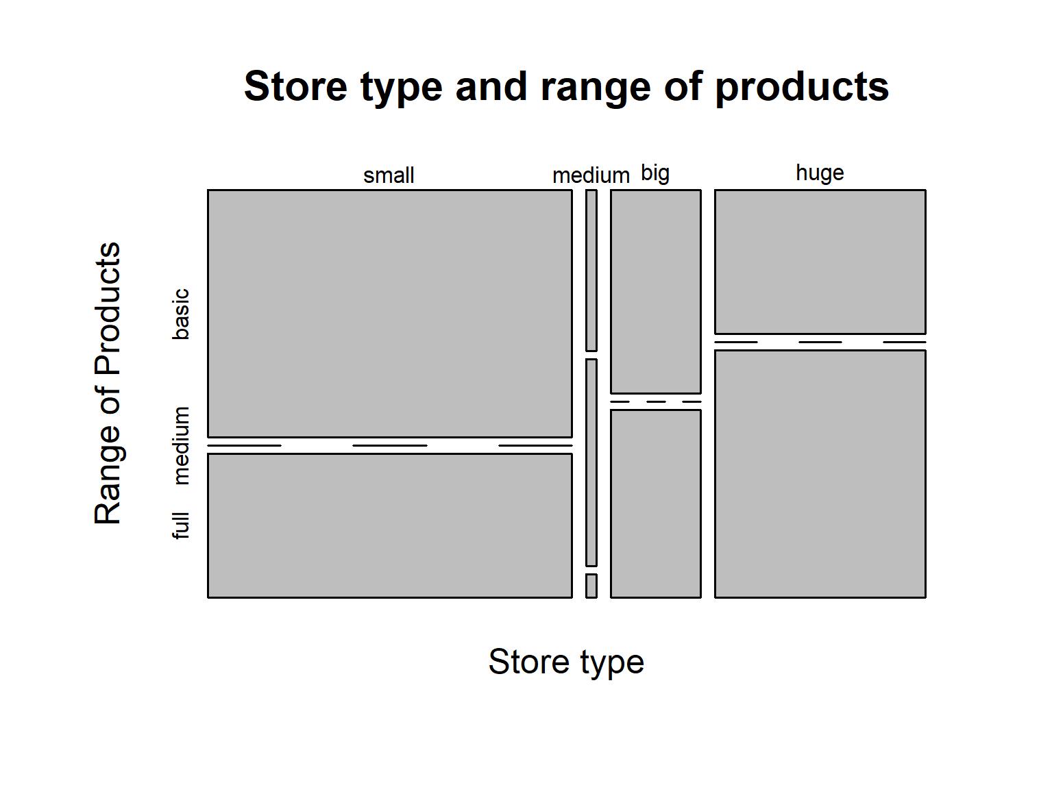
We can look at the data on a sales-by-store level. Simply aggregate sales and other metrics from all days by store and plot them to visualise the relationship of metrics to one another. First, let’s try to understand what kind of shops are in our datasets. The shops are divided by their store type, and the range of products they offer (basic, medium, or full). The relationship between these factors is shown in the plot below.
# Make a data frame that aggregates the Sales data by Store
# (Sales by Store, SbS)
SbS <- days %>%
  # Use only the train data
  filter(set == 'train') %>%
  group_by(Store) %>%
  # Aggregate data by Store
  summarise(
    meanSales = mean(Sales, na.rm = TRUE),
    meanCustomers = mean(Customers, na.rm = TRUE),
    totalSales = sum(Sales, na.rm = TRUE),
    totalCustomers = sum(Customers, na.rm = TRUE),
    daysOpen = sum(Open, na.rm = TRUE),
    daysPromo = sum(Promo, na.rm = TRUE),
    daysHoliday = sum(ifelse(StateHoliday != 0, 1, 0), na.rm = TRUE),
    daysSchoolHoliday = sum(SchoolHoliday, na.rm = TRUE),
    dailySales = totalSales / daysOpen,
    dailyCustomers = totalCustomers / daysOpen,
    storeType = first(StoreType),
    range = first(Range),
    competitionDistance = mean(CompetitionDistance, na.rm = TRUE)) %>%
  # Change the factor levels for nice labels
  mutate(
    range = factor(range, labels = c('basic','medium','full')),
    storeType = factor(storeType, labels = c('small','medium','big','huge')))

# With the combined dataset, let's try and understand the shops data first
mosaicplot(
  storeType ~ range,
  data = SbS,
  main = 'Figure 1: Store type and range of products',
  xlab = 'Store type',
  ylab = 'Range of Products')

We can see that there is a large number of small shops but only very few medium ones. Another noticeable factor is that barely any shops offer the medium product range. All of those that do fall in the medium size shop type. Furthermore, small shops are more likely to only offer the basic product range, while big and huge shops are more likely to offer the full range of products. However, a number of big and huge shops restrict their product range to the basic selection, which seems surprising. Perhaps the store type does not represent an ordinal scale of shop size as initially assumed?
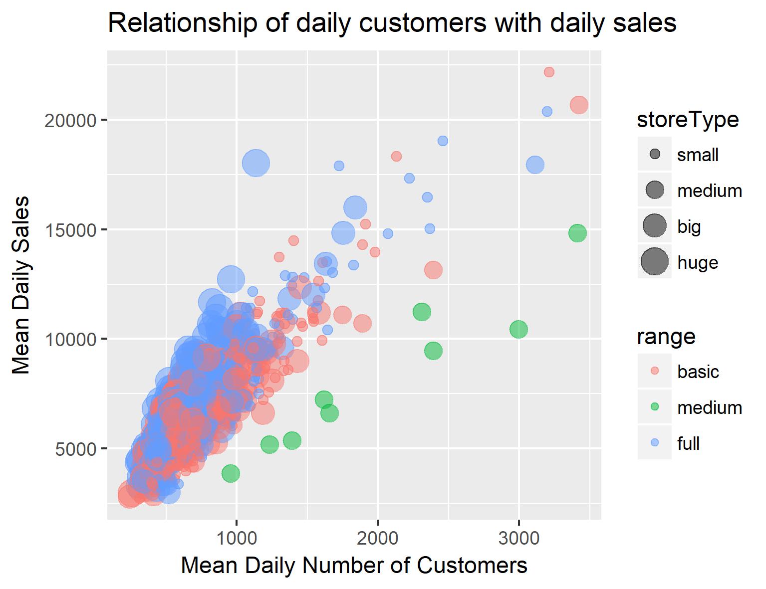
Next we will look at some of the continuous variables available for our shops. We can plot number of customers against daily sales and differentiate by store type:
SbS %>%
  ggplot(aes(
    x = dailyCustomers,
    y = dailySales,
    size = storeType,
    colour = range)) +
  geom_point(alpha = 0.5) +
  ggtitle('Figure 2: Relationship of daily customers with daily sales') +
  xlab('Mean Daily Number of Customers') + ylab('Mean Daily Sales')

Somewhat unsurprisingly, there seems to be a strong relationship between number of customers and sales. Interestingly tough, when splitting this data up by store inventory, both ‘basic range’ stores and ‘maximum range’ stores seem to be doing well (i.e. high sales per customer) while ‘medium range’ stores have lower sales per customer. Additionally, small shops seem to have more customers than big and huge shops. Another indicator that my assumption about the nature of the store type was wrong.
Now I will go back to the data by day. Let’s first look at the sales data by day of the week (Figure 3). We can see that sales are highest on Monday, drop a bit during the middle of the week, pick up slightly on Friday, are lower on Saturday and basically nonexistent on Sunday (most shops are closed). This suggests that the day of the week should be included as a predictor in our final model. We can also use the dates to create time series for shops and look at the variation of sales over time. To take out weekly variability I also included a rolling mean of sales for a 7-day window (SalesOfWeek). The resulting plot (Figure 4) shows us the sales of the 2 years from the beginning of 2013 till the end of 2014. We can see patterns of regular variation in sales over the year. Here is what stands out to me:
- Sales are low on Sundays (most shops are closed!)
- Promotions tend to be every other week
- Sales are higher in week with promotion
- Sales are slightly higher in the time before Easter and distinctly higher before Christmas
# Sales by WeekDay
SbWD <- days %>%
  filter(set == 'train') %>%
  mutate(
    DateType = paste0(StoreType, '-', Date)) %>%
  group_by(DateType) %>%
  summarise(
    Sales = mean(Sales),
    DayOfWeek = max(DayOfWeek),
    StateHoliday = max(ifelse(as.numeric(StateHoliday) > 1, 1, 0)),
    SchoolHoliday = max(SchoolHoliday),
    Promo = sum(Promo),
    StoreType = first(StoreType))
# Plot sales per day of the week
SbWD %>%
  mutate(
    DayOfWeek = factor(
      DayOfWeek,
      labels = c('Mon','Tue','Wed','Thu','Fri','Sat','Sun'))) %>%
  ggplot(aes(DayOfWeek, Sales, fill = StoreType)) +
  geom_boxplot() + ggtitle('Figure 3: Mean Sales per Day of the Week') +
  xlab('Day of the Week') + ylab('Mean Sales')


# Time series of sales
# (Sales by Day, SbD)
SbD <- days %>%
  filter(set == 'train') %>%
  group_by(Date) %>%
  summarise(
    Sales = mean(Sales),
    DayOfWeek = max(as.numeric(DayOfWeek)-1),
    StateHoliday = max(ifelse(as.numeric(StateHoliday) > 1, 1, 0)),
    SchoolHoliday = max(SchoolHoliday),
    Promo = sum(Promo))
# Get a rolling mean of Sales
library(RcppRoll)
SbD$SalesOfWeek <- roll_mean(
      SbD$Sales,
      n = 7,
      align = 'center',
      fill = mean(SbD$Sales),
      na.rm = TRUE)
# Timeline plot of sales data
SbD %>%
  mutate(
    # Rescale some of the variables
    Sales = Sales / 10000,
    SalesOfWeek = SalesOfWeek / 10000,
    Promo = Promo / 1000,
    DayOfWeek = DayOfWeek / 7) %>%
  gather(
    # Get data into long format for ggplot
    key = category,
    value = measurement,
    Sales, SalesOfWeek, DayOfWeek, StateHoliday, SchoolHoliday, Promo) %>%
  mutate(
    # Change the order they will be plotted by
    category = factor(
      category,
      levels = c('Sales',
                 'SalesOfWeek',
                 'Promo',
                 'DayOfWeek',
                 'SchoolHoliday',
                 'StateHoliday'))) %>%
  # Make the plot
  ggplot(aes(Date, measurement, colour = category)) +
  geom_line() + facet_grid(category ~ .) +
  ggtitle('Figure 4: Time Series Representation of the Data') +
  ylab('Rescaled Variable Value')
Modelling
For benchmarking I will create a very simple model: No data cleaning, no feature engineering, just the raw (reformatted) data in a GLMNET and GBM. I am using dummy variables for categorical variables and raw values for continuous variables. The model is evaluated with ten-fold cross-validation, repeated 5 times.
# Transforming factors into dummy variables
daysdummy <- days %>%
  filter(set == 'train') %>%
  select(one_of('DayOfWeek', 'Promo', 'StateHoliday',
    'SchoolHoliday', 'StoreType', 'Range', 'Sales')) %>%
  # Create dummy variables
  model.matrix(Sales ~ ., data = .) %>%
  # Get the Sales data back
  cbind(select(days,
    -one_of('(Intercept)', 'DayOfWeek', 'Promo', 'StateHoliday',
      'SchoolHoliday', 'StoreType', 'Range')) %>%
      filter(set == 'train')) %>%
  mutate(
    # If CompetitionDistance is NA, use max Competition distance
    CompetitionDistance = ifelse(
      is.na(CompetitionDistance),
      max(days$CompetitionDistance, na.rm = TRUE),
      CompetitionDistance)) %>%
  # Create simple training set treating each day as independent observation,
  # ignoring factors Store and Date for now
  select(-Store, -Date, -Open, -set, -CompetitionStart)

# Inspect the variables
head(daysdummy)
GLM
tuneControl <- trainControl(
 method = "repeatedcv",
 number = 10,
 repeats = 5)
model1 <- train(
 Sales ~ .,
 data = daysdummy,
 method = 'glmnet',
 metric = 'RMSE',
 trControl = tuneControl)

model1
glmnet
780829 samples 19 predictor
No pre-processing Resampling: Cross-Validated (10 fold, repeated 5 times) Summary of sample sizes: 702746, 702747, 702746, 702747, 702746, 702747, … Resampling results across tuning parameters:
alpha lambda RMSE Rsquared 0.10 6.91422 1210.331 0.9013087 0.10 69.14220 1214.036 0.9009795 0.10 691.42198 1386.398 0.8870391 0.55 6.91422 1210.402 0.9012853 0.55 69.14220 1228.537 0.8988403 0.55 691.42198 1611.039 0.8521414 1.00 6.91422 1211.024 0.9011885 1.00 69.14220 1245.152 0.8963104 1.00 691.42198 1754.444 0.8288464
RMSE was used to select the optimal model using the smallest value. The final values used for the model were alpha = 0.1 and lambda = 6.91422.
GBM
fitControl <- trainControl(
  method = "repeatedcv",
  number = 10,
  repeats = 5)
model2 <- train(
  Sales ~ .,
  data = daysdummy,
  method = "gbm",
  trControl = fitControl)
save(model2, file = 'saved/basic.gbm.rda')
Stochastic Gradient Boosting
780829 samples 19 predictor
No pre-processing Resampling: Cross-Validated (10 fold, repeated 5 times) Summary of sample sizes: 702746, 702746, 702745, 702746, 702747, 702747, … Resampling results across tuning parameters:
interaction.depth n.trees RMSE Rsquared 1 50 1502.452 0.8639662 1 100 1296.930 0.8922199 1 150 1225.590 0.9011660 2 50 1287.706 0.8954673 2 100 1138.885 0.9137963 2 150 1101.484 0.9186211 3 50 1193.371 0.9078775 3 100 1090.395 0.9202973 3 150 1063.971 0.9238807
Tuning parameter ‘shrinkage’ was held constant at a value of 0.1 Tuning parameter ‘n.minobsinnode’ was held constant at a value of 10 RMSE was used to select the optimal model using the smallest value. The final values used for the model were n.trees = 150, interaction.depth = 3, shrinkage = 0.1 and n.minobsinnode = 10.
Now, let’s see how we can improve the above predictions. I feel like I have a better understanding now of how sales behave between stores and over time, so I will try creating some features from what we have learned in the data exploration. I create a variable indicating days before Christmas and Easter, to incorporate the lag between the holiday and the impact on people’s shopping behaviour. I also calculate mean sales per store and include this values into the set of predictors, which acts as a proxy for the population density, infrastructure availability, and similar factors related to the location of each individual store. Finally, I exclude closed days here. Predicting closed days as 0 would decrease the error metric, but that feels like cheating! Instead, let’s only look at days that the shops are open.
# Include mean sales by store as predictor
meanSbS <- days %>%
  left_join(
    select(SbS, one_of('Store', 'meanSales')),
    by = 'Store') %>%
  group_by(Store) %>%
  summarise(
    meanSales = mean(Sales, na.rm = TRUE))

# Include days before christmas and easter as predictor
daysBH <- days %>%
  mutate(
    Easter = ifelse(StateHoliday == 'b', 1, 0),
    Christmas = ifelse(StateHoliday == 'c', 1, 0),
    StateHoliday = ifelse(StateHoliday == '0', 0, 1)) %>%
  group_by(Date) %>%
  summarise(
    StateHoliday = max(StateHoliday),
    Christmas = max(Christmas),
    Easter = max(Easter)) %>%
  mutate(
    BH =
      lead(StateHoliday, n = 1) * 3 +
      lead(StateHoliday, n = 2) * 2 +
      lead(StateHoliday, n = 3),
    BC =
      lead(Christmas, n = 1) * 3 +
      lead(Christmas, n = 2) * 2 +
      lead(Christmas, n = 3),
    BE =
      lead(Easter, n = 1) * 3 +
      lead(Easter, n = 2) * 2 +
      lead(Easter, n = 3)) %>%
  select(Date, BH, BC, BE)

# Add it all together
modeldata <- days %>%
  left_join(
    meanSbS, by = 'Store') %>%
  left_join(
    daysBH, by = 'Date') %>%
  mutate(
    # If CompetitionDistance is NA, use max Competition distance
    CompetitionDistance = ifelse(
      is.na(CompetitionDistance),
      max(days$CompetitionDistance, na.rm = TRUE),
      CompetitionDistance),
    # If any holiday lag is NA, use zero
    BH = ifelse(is.na(BH), 0, BH),
    BC = ifelse(is.na(BH), 0, BC),
    BE = ifelse(is.na(BE), 0, BE)) %>%
  select(-CompetitionStart)

# Transforming factors into dummy variables
modeldata %<>%
  select(one_of('DayOfWeek', 'StoreType', 'Range', 'Sales')) %>%
  mutate(
    # Dummy value to include test set in transformation
    Sales = ifelse(is.na(Sales), -999, Sales),
    DayOfWeek = as.factor(DayOfWeek)) %>%
  # Create dummy variables
  model.matrix(Sales ~ ., data = .) %>%
  # Get the Sales data back
  cbind(modeldata) %>%
  mutate(
    StateHoliday = ifelse(StateHoliday == 0, 1, 0)) %>%
  select(
    -one_of('(Intercept)', 'Store', 'Date',
            'DayOfWeek', 'Promo', 'StoreType', 'Range'))

# Select train and test data
trainset <- filter(modeldata, set == 'train' & Open == 1) %>%
  select(-Open, set)
testset <- filter(modeldata, set == 'test' & Open == 1) %>%
  select(-Open, set)
From the previous quick tuning runs, we know that the GBM did much better than the GLM. I suspect that this is due to the interaction between variables which the GBM is able to capture while the GLM (with the formula I use) only looks at variables by themselves. We’ll, therefore, use the GBM model. Predictions from this model improved with higher interaction and a higher number of trees, so I will choose some higher values here. I would have liked to do more parameter tuning on this, but the model takes quite a while to compute so I’ll do with these ad-hoc values (if you are rerunning the code, avoid rerunning this bit and load the saved model object instead).
registerDoMC(cores = 4)

fitControl <- trainControl(
 method = "repeatedcv",
 number = 4,
 repeats = 1,
 allowParallel = TRUE,
 verboseIter = TRUE)
gbmGrid <-  expand.grid(
 interaction.depth = 10,
 n.trees = 500,
 shrinkage = 0.2,
 n.minobsinnode = 10)
model4 <- train(
 Sales ~ .,
 data = trainset,
 method = "gbm",
 tuneGrid = gbmGrid,
 trControl = fitControl)

# Predict in-sample
is.prediction <- predict(model4, newdata = trainset)
os.prediction <- predict(model4, newdata = testset)

# Predict with closed days
fs.prediction <- predict(model4,
  newdata = modeldata,
  na.action = na.pass) %>%
  # Create data frame with predictions
  # Use prediction for both train and test set
  cbind('Prediction' = ., days) %>%
  # Set closed days to zero
  mutate(Prediction = ifelse(Open == 0, 0, Prediction)) %>%
  # Set negative values to zero
  mutate(Prediction = ifelse(Prediction < 0, 0, Prediction))
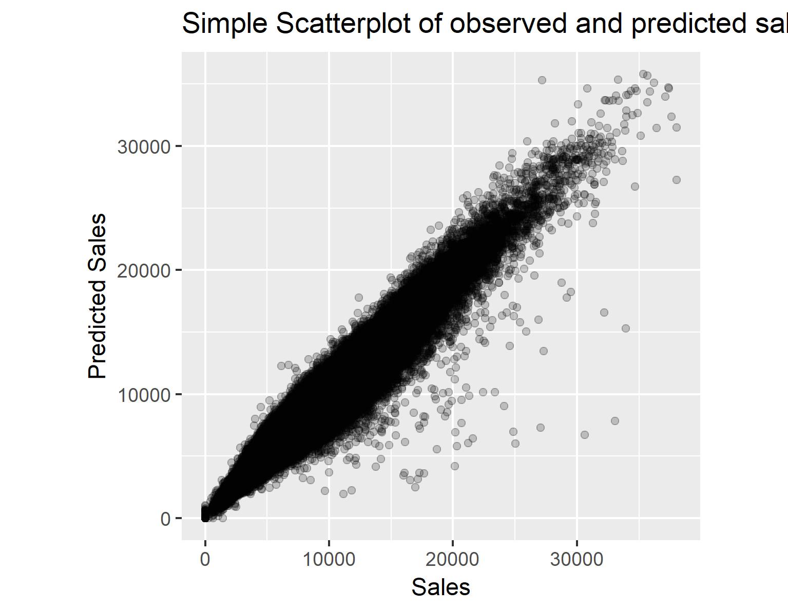
We have a set of predictions now, but I don’t have the Sales values for 2015 so I can’t evaluate on the blind holdout sample. Instead, I will plot the results for visual inspection.
# Simple scatterplot to see the results
fs.prediction %>%
ggplot(aes(Sales, Prediction)) +
  geom_point() + ylab('Predicted Sales') +
  ggtitle('Simple Scatterplot of observed and predicted sales')
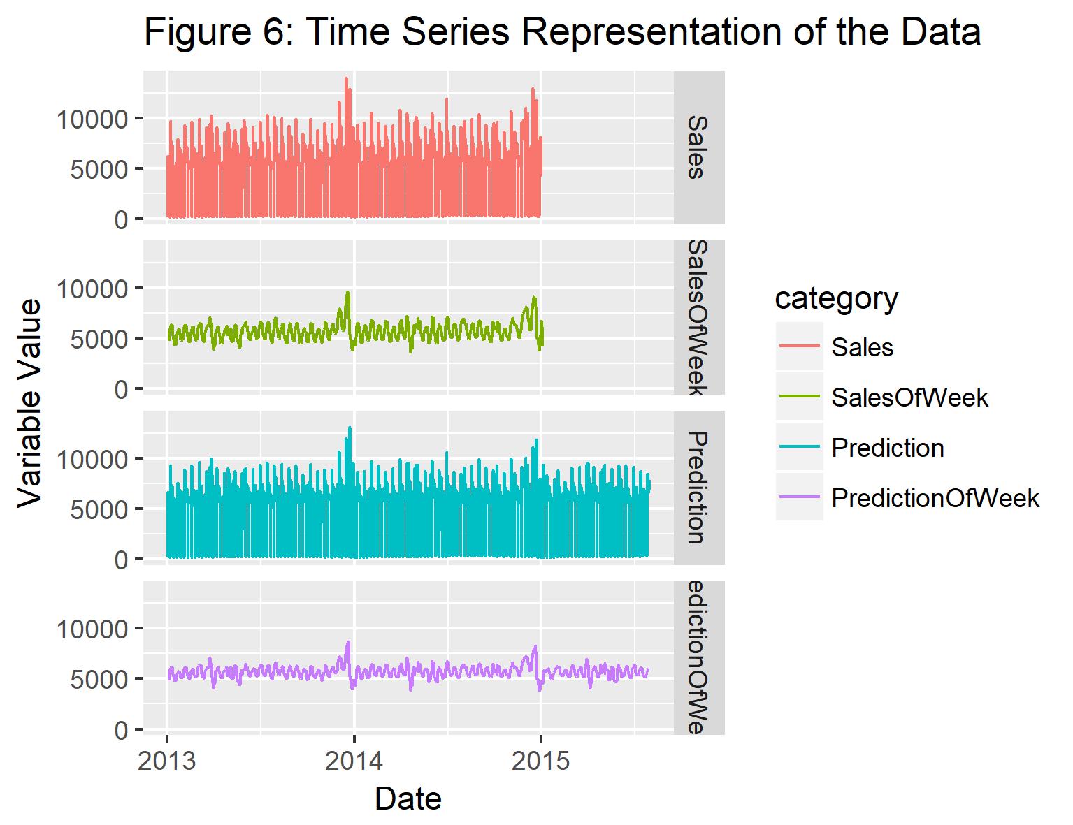
The scatterplot reveals that for the training set there is a very good agreement between the observed and predicted sales, indicated by the long, linear shape of the point cloud. For some values, the model underestimates the values of sales, so it seems that my model is missing out on a part of the signal here. Further research could go into what distinguishes these points from the rest of the data set. When plotting the time series again, it seems that the general trend in the sales data is well captured. The range of variation in the weekly sales data, however, also seems to be slightly underestimated by the model.

Let’s plot the time series again, this time including both the train and the test period.
ts.prediction <- fs.prediction %>%
  group_by(Date) %>%
  summarise(
    Sales = mean(Sales),
    Prediction = mean(Prediction))

ts.prediction$SalesOfWeek <- roll_mean(
      ts.prediction$Sales,
      n = 7,
      align = 'center',
      fill = mean(ts.prediction$Sales),
      na.rm = TRUE)
ts.prediction$PredictionOfWeek <- roll_mean(
      ts.prediction$Prediction,
      n = 7,
      align = 'center',
      fill = mean(ts.prediction$Sales),
      na.rm = TRUE)
# Timeline plot of sales data
ts.prediction %>%
  gather(
    # Get data into long format for ggplot
    key = category,
    value = measurement,
    Sales, SalesOfWeek, Prediction, PredictionOfWeek) %>%
  mutate(
    # Change the order they will be plotted by
    category = factor(
      category,
      levels = c('Sales',
                 'SalesOfWeek',
                 'Prediction',
                 'PredictionOfWeek'))) %>%
  # Make the plot
  ggplot(aes(Date, measurement, colour = category)) +
  geom_line() + facet_grid(category ~ .) +
  ggtitle('Figure 6: Time Series Representation of the Data') +
  ylab('Variable Value')

And that’s all for now. As always, hope it is interesting. Please leave a comment below!
